a zine project

Posts tagged ‘cover’

covering it

worked on the cover concept yesterday:

sketched out the door (which is not as tilted in InDesign). I like the door, especially an outer-door look, but N prefers a smooth surfaced inner door, something more “dressing room,” but she liked the graffiti idea. working on fonts for “TalyaWren.” may rework the curtain-ish pull–I have a sketch with a color but it is too dark to translate well and ruins the peel back idea, but I like its sketch lines better, so work there. and the more I look at that girl, the more embarrassed I become–geesh. my inspiration from print is a Banksy work on a fence. behind the curtain will be an photographic image onto a stage, or from the stage–which I tested and looks really cool.

conceptually. we would like to use the door to tie in w/ Door To Grace. also an exterior door, whether the going in or out, there is possibility and access depending on perception (escape or shelter). In a way, the figure pulling back would be a force of will and/or revelation–as is the use of graffiti. I, first, thought a more androgynous figure w/ and instrument. May still yet. I think any changes there may depend on the photographic image we end up using.

If anyone wants to take any aspect in hand and consult/collaborate on the image with me?–stellar. contact me: talyawrenzine@stonhaus[dot]com or leave intentions in comments.

~L

 (images: 1- mine. 2-via Pinterest via imgur.)

fliers

Last year we starting with one cover concept and Sean even inked it. Nearer To-Print, however, the cover changed as it was inspired by the way we put the zine together. This year we returned to the brainstorming early over the cover because we wanted to translate some of the ideas and elements into fliers to pin up at school. We feel more confident in how we will bind the zine this year (high-tech with staples and tape). Please, let there be fewer changes.

Door was an image we thought could easily tie to theme and fundraiser. Yet, the stage and the view from the wings wasn’t too much of a stretch either.

Waiting in the wings; photo Chirstopher Wahl; (Royal Academy of Dance)

We looked at what surprisingly few images were culled by Google Images. We talked about perspective: Should the audience be in view, or should we go straight across the stage? How prominent should the stage be in proportion to “back stage,” and if there is a figure, what silhouette should we cast? Do we care what gender the figure might be?–as to this, L argued, if the gender of the figure is discernible, it should be male. This isn’t a girls only zine and if the cover has the name it will, then coupled with a male figure, there should be less confusion. N thought L was overthinking it. Her concern was figure w/ Instrument over Ballet Dancer–if there should be one at all. In the end, if from the wings is the idea, the Reader will be standing in the wings. And we are back to proportions and perspectives and lighting, and the translation of values into black and white. Though it could still have a figure.

What to use for fliers comes next. Stage w/ curtains closed. Empty stage from audience perspective. Auditions. L flipped through photographs of N that we might manipulate; ones N wouldn’t mind having used around her peers.

Next. What goes on the fliers.  N lists: Eye-catching Font, Color, and Attractive Image. We Google Image again for Calls for Submissions. We list what needs to be on the flier without cluttering it. And really, what can we do in a short amount of time? Something great, of course–we hope.

The fliers? They are coming very soon. Maybe tomorrow. Will post the finished products here.

to print!

We are to print! Hurray!

The weekend was well-spent.  It was a bit crazed though and perhaps more angst-filled than necessary. Okay,  I know it was more trouble than necessary. Here’s why: We changed the cover.

When contemplating binding options (something we will decide on next to first in the future) we settled on Accordian. I don’t know if that is an actual term for binding/publishing. We have quite a few pages that we did not want to shrink or cut for this edition. We had already moved from half-page to full 8 1/2 x 11. Still, we were up to 49 numbered pages. Include covers, inside and out, 25 sheets.  Lying in Saturday, I ignored my bladder and contemplated the zine (not unusual) and I thought: a small accordianed zine would be cute, a post-trip postcard-like zine. Not much later I was telling Sean of the idea. That is when we kicked-out the idea to do that with this Spring 2011 edition of TalyaWren.

So, you think organizing pages is tricky enough with a regular flip-the-pages structure…

In the end, Sean took the pages, used some tape, and tried to play out the structure. Bless him for taking on that headache. I thought I had had a good vision of it, but there was a flaw somewhere. So Sean worked it out, and two pages were still cut. The cutting was a difficult decision with which N met nobly. Suggestions were made, but she had the final word.

What does the format have to do with the cover?  Well, we were thinking of examples of accordianed pages. The cassette tape insert came to mind. Yep, that was entertaining explaining that one to N.

Sean had work to do this weekend so I took over the drawing of the cover. Some trace paper, black ink, N’s colored pencils, and some images from inside the zine–voila! I think I have graduated from Kindergarten art to 1st grade! I made them swear that it wasn’t quaint or cute or charmingly infantile. Were they humoring me? new talyawren cover

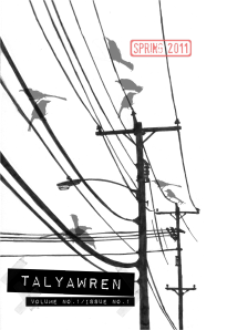
Sean’s previous cover is fantastic. We do love it so. So we kept it: back cover Not too, shabby, eh?! It was going to lie under the flipped out cassette case, half-revealed, but Sean hit the transparency button and ‘ta-da!’ A portion of it will also reappear on the Table of Contents with a hand-drawn frame by N (which turned out rather spectacularly!).

So with cover changes and binding issues, we had a busy weekend, especially yesterday. It was a bit rushed, I worry. (We rearranged some pages as well.) But Sean is right–It’s done. Now to print, and to purchase tape–you know, to accordian those pages. Just when I was thinking the zine wasn’t hand-crafted enough!

We will be printing 30 copies. (Should have a fresh-eyed reader scan over it first–Nah, it is done!)

We hope and have every plan to have the zine in the mail by Monday morning April 11th at latest.

Now for those Bookmarks N promised…

ad-ing to the back

I was a bit of a loss as to what to do with the back cover of the zine. We’d gone with phone lines which we felt worked with the collaborative nature of the zine, the connecting lines, the calls for help… The Table of Contents is modeled a bit after a phone book page. We even created a fake advertisement to adorn what little empty space remained. Working on said ad, bugging Sean for a sketch, the thought arrived: Why not make a few more and do the back like a phone book’s rear end as well…plastered with bumper stickers (or removable magnets). Wish we could go with a removable magnet idea.

A few more fake ads were created. A thank you note is tacked on. Maybe a post-it note grocery list? A ring from where a glass rested on in it?

One of the ads: was considering making the cakes icing a bit more colorful or what-not, but I think I will just forgo the effort, maybe a reader will color it in for me?:

covers and stamps


I think Sean did a wonderful job on the cover.

He left the stamp placement to me (L), so that may move before final print.

The stamp holds promise, as if TalyaWren might have another season. We’ll see. Meanwhile, I’m excited to see this in Print!


spring break: days 2-4

Day 2 of Spring Break found us counting pages–again–and organizing the layout–again. N decided we needed more for the Music portion of the zine. A short brainstorming session resulted in: 1)  N deciding to write about one of her favorite albums with Sean writing a brief intro for the band. And 2) sending a please, please, please message to friend-from-way-back Art Heffron who works with Music Artists, promoting their sound, arranging venues, photographing them (yep, he is also a talented photographer), and just being awesome like him–in the Denver area. Art has generously agreed to write an article about one of the musicians he works with and has the joy to know–bless him!

Day 3 of Spring Break was a day of rest that bled into today, Day 4. Actually, a section page was built Day 3, and some “top 10” opinions were expressed. Today: other than posting this quite late, L will likely putter around with refining some lists, and —yay–updating our “fund-raising for the Germany trip” log : two checks in the mail today! And maybe she will corner Sean about one itty-bitty addition to the Cover…a stamp reading Spring 2011… you know, in case we see more of this TalyaWren in the future.

*****

Art’s work (Denver, Colorado):  Strings & Wood Concerts site and myspace. Also, check out his photography site.

photograph is N, Early Fall 2010, listening to music while writing…a commonplace sighting.

a productive weekend

note to selfHow many e-mail exchanges does a correspondence make?  Beloved author Adrienne Kress provided answers to N’s interview questions and we worked on the pages during the weekend. Next we decide on a picture of the photogenic author and N needs to write an intro paragraph or two. Meanwhile, L has never seen N so punctual in returning an e-mail–she slaved over a return e-mail for quite some time.

L logged in several hours over the weekend copy/pasting, designing, and religiously saving pages in InDesign. It was good to get the Author Interview in, as well as a few of the stories and other features to see how the pages were going to run at the smaller zine format. In the end, we decided to go with the larger than our usual format. We decided that it will still look great.

Sean finished the cover this weekend!! and he said that the full page shift shouldn’t create any re-work to the cover design.

It was a very productive weekend. Knowing the zine is moving forward on a good foot, we can focus some of our attention on the fund-raising effort. N has to finish paying for her plane ticket by April 1st…

C: contrib, content, covered

today’s post is brought to you by the letter C.board

Contributors: We have received some great submissions of Art and Writing. [Thank You!] While we have been exerting energy toward drumming up monetary support, with the submission dead-line for the zine-contributions past*, we are now going to be putting more energy into our Money Contributors. We are looking for Creative forms other than drafting reminder letters…  thanks to those who have already sent cash/check—you have helped us secure our spot with all the necessary deposits. Now to meet the larger April 1st Deadline.

Content: lists of what we have are made and organized. Sean suggests we cartoon out our pages for the sake of maximized communication; such is being done for the Features we have devised. And InDesign is up and running. InDesign has been good to us in the past and we plan to create content in it as well as import pages—yep, some of the cut & paste will actually be credited to scissor and glue stick.

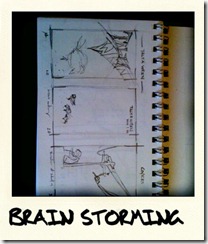
brain stormingidesaswr sketch

Cover: Sean was –er— commissioned to do the Cover of TalyaWren; paid in hugs and praise and thumping pats on the back. We are really excited as the finished product is almost ready! The stages have been fun to watch. And while Sean complains of a rusty hand at this, his work is good. The pics are from the other day, but much has been done since. I can’t wait to show you the finished Cover!

s at work covercover work

*if you missed the deadline and are still interested: leave a comment here or e-mail me or message me on facebook.